Monday, July 6, 2015

More painting progress

This is my first painting from the trip to the Canadian Rockies.  It is a view of Moraine Lake in the Valley of the Ten Peaks (in Banff, Alberta, Canada). I still struggle with composition and colors, but I'm happy with the way this came out. It was a magnificent view of the mountains and glaciers.  I hoped to give some sense of the massiveness of all those mountains.  As usual, it was hard deciding whether or not I was finished or if I would still do a little touching up, but I think this is done.

Oil painting, 16" x 20". You can buy a card or print here.

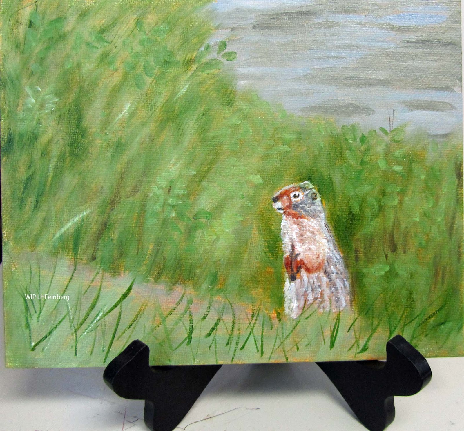
Meanwhile, I decided to do a couple of small panels.  These are not done, but I'm having fun with them.

This little guy seemed to be watching us. I'm going to continue working on the panel this week. I'm calling it "watching the tourists". Oil on canvas board, 8" X 10"

I planted dahlias for the first time this year in front of my house. I took a photo of the first one to open. I'll be working on this one and hope to finish it this week. I'm happy with the way it looks so far. Oil on canvas board, 8" X 10".  The background is black gesso. I think I'm going to leave it that way as I like the way it sets off the flower and leaves.


Friday, June 19, 2015

Canadian Rockies

I took hundreds of photos on our trip to the Canadian Rockies (Calgary, Banff, Jasper etc.). Photo above was taken in Jasper, across the street from our bungalows. The female elk (wapiti) are called cows, the babies are called calves.

It's hard to believe that some people do not know how dangerous it is to approach wild animals. I guess they think they are like the ones on the television. Anyway, we saw bear (safely from the bus), deer, elk, chipmunks, ground squirrels and other rodents.

I took too many pictures of the glaciers, mountains and lake to post here, but if you have the time and patience, you might enjoy viewing them. Here is a link. Linda's photos of the Canadian Rockies.

I forgot to post my last painting before I went on vacation, so here it is:

Time?


And finally, a new profile picture:
I loved the different colors on the lakes there. Some interesting greens (from glacial silt), some bright blues. I'm having difficulty decided which image to paint first!

Friday, May 29, 2015

Back to acrylics

In the Grand Tetons, 16" X 20", acrylic on stretched canvas.

I think this is done now. I haven't put it up on my website (so no link yet) because I'm still thinking about it. After working with the oil paints for my 12 week class, I found it a little strange to go back to acrylics. I really enjoy the quick drying time, but at the same time, I liked the ability of the oil paints to last longer and mix better. I will probably continue to experiment with both media. I will definitely use the oil paints if I do any more outside painting (plein air). I hope to do some of that during the summer.

Meanwhile I started another urban painting from my photo of Manchester (NH)'s downtown scene.  I think I am going to continue in monochrome instead of following the colors in the photo. I like the way this looks so far. This is also acrylic paint, but 8" X 10".

I found simplifying all the details in a city scene quite complicated. I will have some people walking on the sidewalk in the finished painting, but I'm definitely leaving some details out.  I'm enjoying working on this one.

I am heading out to more mountains soon, so the next post will probably have photos instead of paintings. I hope to have some time to work more on the urban scene before I leave.   I'm enjoying the spring weather (although it's very changeable from day to day in New Hampshire). Here is a little photo from yesterday's walk around the pond.


Wednesday, May 13, 2015

Back to School, Final

By the Sea, 16" X 20", oil on stretched canvas. I finally finished this painting that I had started in my oil painting class.  I really enjoy seeing the different colors in the oceans and seas when we travel. They are very different than the colors of the Atlantic Ocean as seen along the coast of New Hampshire and Maine. This scene was of the Mediterranean Sea from Caesaria, Israel.  I had taken photos when we traveled there. I had made a very abstract painting of this scene on Yupo paper years ago and decided to do something more realistic this time.  We hope to go back to Israel in 2016.

Meanwhile, I was tired of painting with oils and did a gouache, pen and ink painting (see last post). Then I gesso'ed a hardbord panel and painted some day lilies in acrylic, but in an oriental style, not a realistic one. I have painted these before too, but with watercolor.

Day Lilies 3, acrylic on hardbord, 9" X 12". You can see the earlier painting and this one on my website. I think it was a good break to switch off from doing the complicated realistic oil paintings and just play with other materials.

After that I assembled another canvas using stretcher bars (with primed canvas I had in stock). I have decided that it is not worthwhile to do this. It's easier to buy the canvases already mounted. I had difficulty getting the canvas squared up properly. Anyway, I started an underpainting with acrylics, of the Grand Tetons. I did a sketch first to change the composition around a little from my photo (which I had already cropped).  I blocked in the shapes and now I need to decide whether to proceed with acrylics or oils. I might do this one in acrylics and a second one later on in oils.  I love the way the oils blend and spread, but I get frustrated with the long drying time. Decisions, decisions. . .

This is the first block in. The final composition will probably be a bit different.

Saturday, May 2, 2015

Back to School, Part 5

Pelican Party, 18" X 24", water mixable oils on stretched canvas.
I think this painting is finally done. I haven't posted it yet to my website in case I change my mind. I painted this with palette knife and brushwork. I didn't put in as many pelicans as were in my original photo. The pelicans were at the Laguna Beach State Marine Reserve (California). There were some other birds on the rocks too, probably cormorants or terns. I couldn't tell from the photo, just saw some black birds.

It was actually fun painting with the palette knife, but the downside is that the paint is so thick that it takes a long time to dry. That meant I couldn't add the pelicans until the painted rock was dry. I used a brighter blue than I usually use for the Pacific Ocean (Phthalo blue/red shade). I also made some mixes with white and with cerulean blue. I thought that really brightened up the painting.

I used an olive green and titanium white mix for some of the rock and some of the guano. I used raw umber mixes for the browns.  I didn't really need too many different colors for this painting. There is a little bit of sap green to show some moss or grass on the rock (you can enlarge the view of the painting by clicking on it).

I am finished with my 12 week oil painting class at New Hampshire Institute of Art. It was hard work, but I feel that my skills with this medium have improved. I still have one more painting to finish (below).


By the Sea, WIP. Since this is the Mediterranean Sea, the sea colors are very different. I used mixes with Viridian.  I'll try to finish this one within the next week or two. These two paintings are really the first time I have tried seriously painting seas/oceans. I am working on this one with brushes, not palette knife (I had enough of that for a while with the last one.)

Then I took a break and did a little illustration with gouache, pen and ink. This one is on Canson 140 lb. rough paper. I enjoyed playing with my old paints, although some of them were a bit dried up. Even though they were dried up and I had limited colors, I was still able to make a study I was happy with. I don't like the image enough to spend time painting a larger painting. This is the view of Fort Constitution (from Fort Stark) in New Castle, NH. The water is the Atlantic Ocean.


I think that's it for a while on ocean/seas/water paintings. I have prepared a hardbord with gesso to play with next. I'm thinking about flowers to go on it. Spring is slowly getting here and my daffodils are open now.  I keep watching for more plants/flowers to open. Our bikes are ready for their first ride of the season and I'm looking forward to that too.


I ordered some new business cards from Vistaprint. It was actually cheaper to order cards from them than to keep printing a few of my own each time I do a show. The paper is a very good quality too. They have sales periodically. I waited for a good sale and I'm happy with the cards. My next scheduled show is July 26th in New Castle, NH.

Thursday, April 16, 2015

Back to School, Part 4

Erev Shabbat (sabbath eve) in Tsfat (Safed) Israel, 16" X 20" oil painting on stretched canvas. I enjoyed working on this despite my difficulty with greens.  The teacher and my classmates were all very helpful. You can buy a card or print directly from my website. The original is also for sale. More information is available on that site too.

One thing we all agreed about in class is that no matter how hard you try to photograph or scan an original painting, the colors never quite look the same as the original.  I have two monitors and when I look at the same JPG photo, it looks different on each one even though the monitors are from the same manufacturer.

I haven't been writing every week as I have been busy with the Passover holiday, my painting, family and gardening. Now that winter is (hopefully) finished here, I have lots of cleanup work in my yard to catch up with. I cleaned my vegetable patch and planted some onion sets. They are very hardy and will survive another frost if we have one more.

Meanwhile, I finished two more paintings.


Monarch Amid the Mums, oil painting on canvas board, 9" X 12". I painted this from a photo I took several years ago.  The monarch butterfly was kind enough to stay long enough on my flowers that I had time to grab my camera and take some photos.


Birches at First Connecticut Lake, 9" X 12", oil on Ampersand panel. I found it more difficult working on the Ampersand panel instead of canvas.  I have ordered a few different types of panels to try out and experiment with. I enjoy trying new processes and playing with new art supplies.

Meanwhile, I have started two new paintings with ocean/sea views. One is of the Pacific Ocean at Laguna Beach with Pelicans on a big rock. I am doing that one with a palette knife.  I only have one more class left in this series, so I may not get it done by the end of the semester.  I also played with colors and did a small painting based on the colors in a scarf that I like.  I don't know if I'll do anything to finish that one, or just use it as a background for a card later one.

The other painting I started is a view from Caesaria (Israel) of the Mediterranean Sea. I had done that one before in a very abstract manner. (It was done on Yupo paper)  The oil painting will be a little more colorful and realistic.

Happy Spring!


Friday, March 27, 2015

Back to School Part 3

I was getting tired of looking out my window and seeing snow, so I pulled out an old photo and made a small painting. This one is an oil painting, 8" X 10" on canvas board.  I was pleased with my teacher's comments. He said my painting was an improvement over the photo. :)

I posted it on my website and you can order a card or print here.

I finished the painting I was working on earlier and gave it a title: Valor and General Stark, those are the names of the horses. This one is 16" X 20".  I'm enjoying the oil painting class and learning more than I was learning on my own from DVD's and books.


My acrylic painting of the bridge is now up on the conference room wall at Webster House and I stopped by yesterday to deliver more paintings and had my picture taken with my painting. Seeing it this way gives a better idea of the scale of the painting. It is 4' x 5'. I'm very happy with the way it looks and I changed my image at the top of the blog to this one.  My smaller painting of the same scene is on display locally and I'll be bringing it back home next week.


I didn't work on my painting of birches this week, so I still have to finish that one. I decided to start a new painting instead, one that I felt more emotionally connected to.  I picked out two photos I had taken in Tsfat (Israel), just as the Sabbath eve was beginning (not quite sunset yet). Last week I brought a sketch to class since I had to combine photos and rearrange them a bit to get the image I wanted.  This week I started with a color study on oil painting paper. I taped the paper to a white board. This was the first time I had used this paper and I wasn't really comfortable with it.  (Also the teacher suggested I do a value study next time as well as a color study.)  

I liked the way the composition worked out from my combination of photos. I worked on it more in class and will continue next week with more detail.
Still learning about values - the sky is the lightest light (even though it was getting to be sunset). I'm starting to get a little more comfortable with my brushes and oil paints now.  Some of the other students thought the image might be from France or Italy. I will probably title it "Erev Shabbat" which is Hebrew for eve of the sabbath.  That is Mount Meron (Israel) in the background.

Monday, March 16, 2015

Color Charts for Painters


It’s easy to make your own color charts with your own paints. The photo above shows one method of making a color chart.  These are Winsor & Newton Artisan water mixable oil paints.  The company puts out a chart too with teeny tiny photos of the colors.  I drew straight lines with a ruler and permanent marker on 9” X 12” gessoed canvas paper (these come in a pad and are not too expensive).

Since I was just interested in seeing what the colors looked like in a larger view, I did one chart for each group of colors. I also did one for the neutrals, but it is not shown here.  Across the top row I wrote the color name and noted if the color was opaque (“O”) or transparent (“T”).  I painted the actual colors in that color family on the second row.  On the third row down, I added transparent white to each color.  On the fourth row down, I chose yellow ochre to mix with it on some of the charts.  The other rows vary depending on what I wanted to see. (You can enlarge the photo above by clicking on it).


I took a color mixing class in acrylic paints a few years back. The charts we made there were more about color mixing. These were done on acrylic paper. (photo below)


Top left chart shows primary colors, red on left in box 1, yellow in middle box 3, blue on right in box 5.  Other charts are variations on color mixing.  Most of them show the first row had one color on the left (box #1) and the one we wanted to mix it with in box #5 on the right. Then we mixed the two colors together 50/50 and put that mix in box #3. Again mixed box #3 with #1 into #2; then #5 (original color) and mix #3 into #4.  The second row down were the top row mixes mixed with titanium white. The third row down contained the first row’s mixes mixed with neutral gray; and the fourth row down contained the top row’s mixes mixed with black.  These can be done with any medium, not just acrylic paints. I added some other mixes in box #6 to see what they looked like.

Basically, most of us know that when we mix blue and yellow, we get green. But with pigments there are many yellows and many blues, so we will get many shades of green.  Making color charts will help with decision making when you are painting.

On my own, I decided to try to figure out what my paint tubes looked like, which ones were transparent and which ones were opaque.  I made another series of charts (below).

In these my first column contained my artist grade paints. The second column contained my student grade paints and the last column contained some craft paints I also had from other projects.  It was interesting to see the differences in the different grades of paint. The black line down was to help me determine which paints were opaque (full coverage) and which ones were transparent.


These are tedious exercises, but worthwhile and you will have your own color charts with your paints to refer to for every painting.  If you are really serious, you can note down your mix ratios too (as can be seen in books about color theory).

Happy painting!


Thursday, March 12, 2015

Back to School Part 2

More work in progress. I hope to finish this one at my next oil painting class. This is my attempt at another urban landscape, 16" X 20", water mixable oil paint on stretched canvas. The teacher is really helping me focus on values, dark and light, to make the scene interesting and improve my painting techniques.   I had started this painting a while ago, took a break while I worked on the big bridge painting (previous post) and have been working on it again now. The mounted police were in front of Veterans Park in downtown Manchester.  I don't have a title yet for this painting.

This was lesson 4, a couple of weeks ago.  My heart is not in working on still life paintings, but it is good exercise.  This was an example of metal and reflections. I worked in the same oil paints on a canvas board, 9" x 12".   The urban painting above was worked on for Lessons 5 and 6, plus I started a new painting (below).

As I was thinking about what to bring to class for Lesson 6, I cropped a photo from Pittsburg, NH of the First Connecticut Lake.  I bought a 9" x 12" Ampersand panel from the school store to try out.  I wasn't too happy with it as the oil paint really seems to smear, but I'll keep at it for a while. I did my initial sketch as a kind of negative painting, putting the design in between the birch trees. I'll keep working on this one for a while. The birch trees are not really white, so I'll be introducing some more subtle colors into them.

In between classes, I made color charts with my oil paints. I had done that with my acrylic paints when I was studying acrylic painting.  I found this very helpful.  I do not have really good color vision (I roll my eyes when I hear someone say they see "green" or "purple" in something that looks white to me).  Having the color charts with the mixes is very helpful. These are a bit tedious to make up, but worthwhile. I'll take some photos and post them next time.


Wednesday, March 4, 2015

Painting on a large canvas

This was my first experience painting on such a large canvas. The canvas was not mounted on stretcher bars so that created another issue.  This project was done as a winter project as part of my Friends of Art Manchester group for another non-profit, Webster House . The painting above is acrylic on canvas and is approximately 4’ x 5’.  I thought it might be interesting to some of my readers to learn about the process.

If you have been following this blog for a while, you know that I had already made two studies of this scene, one is 8” x 10” and the second one is 16” X 20”. The larger one is currently on display at the Triangle Credit Union (Manchester, NH) for the month of March.  I submitted it to the Manchester Artists Association  and won one of the “Artist of the Month” certificates.

The walls at Webster House are very large and very bare, giving it an institutional feel.  Since we had already done two projects for Families in Transition , I thought Webster House might like something similar.  I made an appointment and went in to speak with the director.  He was thrilled with our idea and agreed to pay for the materials.  I measured the walls and figured that the small paintings we had done in the past would not work with those walls.  We had done a mural during the summer (30 feet long by 3 feet high). Each artist had a space of 3’ x 3’.  I thought we could go a little bigger. We did not want to do another mural as we wanted the paintings to be movable.

I priced out the canvas materials and asked for some samples from Big Duck Canvas.  They were happy to send me some samples. We agreed on the #12 primed canvas.  It would be very messy for us to have to prime the canvas first.  After more discussion, we decided to get extra canvas so that we could get a good discount and two of our members bought the extra.  One of our members warned us to buy the canvas on a roll, not folded as it would be difficult to get the folds out. That was good advice and we bought a roll of 12 yards.

Cutting the canvas to size was an interesting project as none of us had a big table. So we measured and cut the canvas on a cardboard mat on the floor.  Two of us had sewing machines and we stitched the edges of the canvas, making a big enough hem at the top for a curtain rod.  We thought about grommets to attach the canvas to the wall, but decided curtain rods would be easier.

Unfortunately hanging the blank canvas from the curtain rods did not provide a good, stiff surface to work on.  I bought a staple gun (for my smaller hands, my husband’s big one was too hard for me to use) and stapled the canvas to the wall.  I borrowed an Epson projector and projected the image on the canvas.  It was going to be way to much work to do a grid, which is what I usually do to go from 8” x 10” to 16” x 20”.  If you are thinking about buying an opaque projector, investigate carefully. The cheaper ones do not work well unless your room is completely dark.


This is what the image looked like projecting from my computer onto the canvas that was stapled on the wall.


Next step was to draw out the basic shapes. I did not need too much detail, but I needed the shapes to be in the correct proportions to each other. Photo below shows what the canvas looked like when the projector was turned off.


I started painting from the top down. I used a big brush and a step stool, but even so this was a little difficult for me, but I was enjoying seeing the painting progress. I used blue painter’s tape (like masking tape) to help me with the straight lines of the bridge, the pylons and mill buildings.
I started to add a little more detail.


Unfortunately, when I put in the river, I thought it would be better to leave a blank white area for the railing.  That did not work and I had to paint over the railing and repaint part of the river. I used a lighter cerulean blue/white mix underneath and a darker blue (Prussian) mix over it to give more of a sense of the river water (which is actually a bit rough in that area).

Once I fixed the river and had the railing in, I continued with underpainting some areas. I also got some help from another artist on some of the colors.  I had a hard time with the colors on the pylons.


And the final view while still stapled to the wall.  After I removed the staples, I had to touch up the canvas that was under the staples, but that was the easy part.  Deciding when the painting was actually done and not keep fiddling with it was harder.  This was a very challenging project and I was happy to take on the challenge. It took me over one month to complete.