Showing posts with label color. Show all posts

Monday, October 24, 2016

Still practicing

I think this is finally finished (see last post for earlier process) although I haven't put it up on my website yet. I'll wait a few more days in case I change my mind. (Mesa Arch, Canyonlands National Park, Utah, water mixable oil paint on hardboard, 16" x 20")

Meanwhile, I did a group of studies of gates from my photos in Ein Hod last March. I find myself fascinated with all the wrought iron doors and gates. There were a few wood ones too.  I don't think I'll make any paintings from them, but they were interesting to sketch. I did pencil sketches first, then went over them with markers. Good practice.


I have done some paintings with gates in the past and they are on my website.

After watching a video showing how to use oil paints in a watercolor style, I practiced painting from my photo of Taylor Mill in Derry, NH.  Unfortunately we have been in a drought situation and the water was not running over the wheel. I had to imagine what it would look like. I'm hoping for lots of snow this winter, then I'll go back and take another photo or paint plein air. It was an interesting old building.
Taylor Mill study, 8" X 10", water mixable oil paint on canvas board.

I decided to get away from realistic paintings for a while and watched an online video of sunflowers done in a Van Gogh style. That was fun using acrylic paints.

Meanwhile, even though we have not had enough rain, the fall leaves are still looking very beautiful. This is a photo of the tree behind my house. I love the fall colors.

Tuesday, August 9, 2016

Costa Rica

Lenticular cloud on Arenal
 
I decided to play with some of my photos from my Costa Rica trip a few years ago. This was an experiment with triadic colors, water mixable paints, 8" X 10". It is a view of a lenticular cloud on the Arenal Volcano. I did it more impressionistically.  If I decide to paint it more realistically, I will need to do a better job with my drawing and will probably use regular colors.
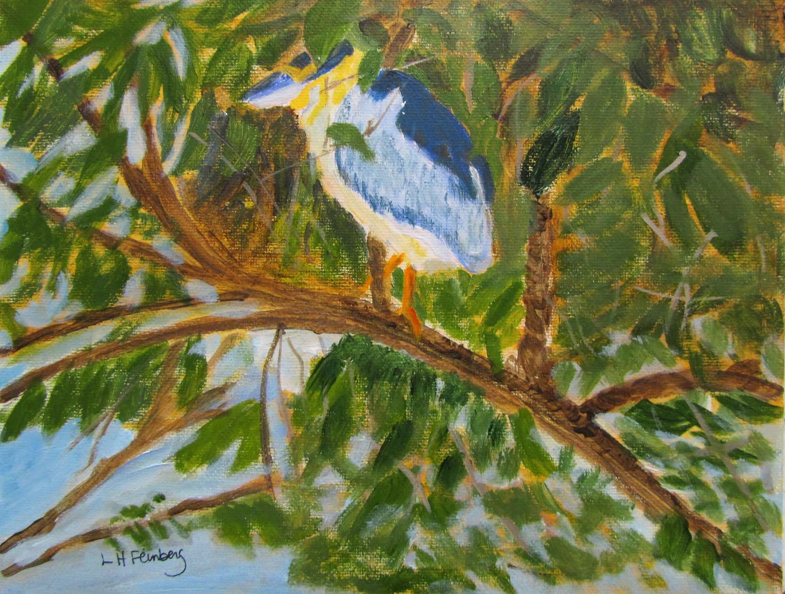
Boat Billed Heron
 
This one is a boat billed heron, also 8" X 10", but done in acrylic paint. I'm not putting these up on my website, just practicing.  I have several other old paintings I am going to try to improve. I'm still taking online classes and trying to learn more about composition. I'm thinking about signing up for an urban landscape painting in the fall. I'll see how well I feel by then. I am walking a little better now that I have had a series of injections in my knee, but still have pain (much less though). The fall painting class will involve walking to sites downtown to paint so I have to think about that.
 
I spent last week on retreat with the National Havurah group in Rindge, NH. I studied psalms in the morning and some art in the afternoon, also lots of singing. Seeing how other people are dealing with their disabilities and being in a beautiful environment has also improved my attitude.  It helps to be in a beautiful environment too even though I couldn't do the walking in the woods that I usually enjoy.  One of the things I miss here and look forward to on these retreats (the next one is a weekend in December) is the hevruta study. That is pairing students in groups of 2 or 3 to study a passage, then we come back to the group and discuss more. It is great bouncing ideas off other people. The Havurah group is very inclusive and everyone was welcome, there were lots of babies and children there too. 
 
My last post was on Rosh Hashanah cards and I brought some with me to the retreat and sold many of them. There are more Rosh Hashanah designs on my website, not just the ones I posted last time, in the Jewish Holidays gallery.


Thursday, August 6, 2015

Traveling and Landscapes

I finished my painting from our June trip to Canada. Athabasca River, oil painting on stretched canvas, 16" X 20". My website now offers T shirts, tote bags and some other items as well as cards and prints. Fine Art America has partnered with Pixels.com to print these items.  This view of the river is right before the water falls. I loved the trip to the Canadian Rockies (Alberta) and will probably paint more views from my photos. (Click on image to enlarge)

Meanwhile, my son's band was playing on a boat in Portland, Maine. I had never done a harbor cruise before and this was great. I've been to Portland many times (great museum there as well as fine restaurants and interesting downtown), but just cruising around watching the boats, old forts, lighthouses was very enjoyable.

Portland Harbor is also an oil painting on 16" X 20" stretched canvas. I enjoyed working with these colors too, quite a change from the colors in the Athabasca River painting.  This is the first time I've attempted an oil painting of a harbor with boats. I liked the way it came out. I did a small acrylic study of the sailboat first (image below). Then I decided I liked it enough to attempt a larger painting, but I liked the full scene for the larger painting, not just the sailboat.


Portland Harbor study, 8" X 10", acrylic on canvas board. I find that I'm enjoying working with the water mixable oil paints more as I get used to them, but I still like the acrylics too. Many times I use the acrylic paints as an underpainting. That helps me with colors as well as composition.  In composing the scene for the larger harbor painting, I moved the small boat in front from my photo (using scissors and tape on my printout, not Photoshop!) and placed it off center. The original photo showed it too centered for me. I also print out my photos in black and white as well as color. That helps me both with composition and values (light/dark).

In between the serious paintings, I also played with paints, trying a night scene on paper.
Night Study, acrylic paint on Strathmore acrylic paper. This one just came out of my imagination and some views I had seen on the internet. While Manchester (NH, my home town) is on a river, it certainly doesn't look like this, day or night!  I liked the way the sky came out, but that's about it for this painting.

Then I tried a self portrait, using the water mixable oil paints again, this time on Arches Oil paper. The nice thing about doing a self portrait is that I could make myself look much younger. The hard thing was mixing the colors. I need to learn how to make shadows better with these paints. Anyway, it was a fun experiment and I learn something new each time I paint. I'm just posting a little clip of this one here as I really don't like the full portrait.

By coincidence, thinking about my last posting on titles, Jason Horejs posted a good video on the same topic recently.  http://reddotblog.com/art-marketing-minute-video-creating-compelling-titles-for-your-artwork/

I bought a used pochade box (portable paint box) from an artist friend. These are very expensive to buy new, but I wanted one for plein air painting (painting outside). I would like to practice a bit before our next trip to Israel (next year). We will be staying at Ein Hod (an artist's village) for a full month and I plan on painting outside, not just from photos. I definitely need more practice with that. I've tried it out in my studio, but not outdoors yet. Looking forward to that too.

Wednesday, May 13, 2015

Back to School, Final

By the Sea, 16" X 20", oil on stretched canvas. I finally finished this painting that I had started in my oil painting class.  I really enjoy seeing the different colors in the oceans and seas when we travel. They are very different than the colors of the Atlantic Ocean as seen along the coast of New Hampshire and Maine. This scene was of the Mediterranean Sea from Caesaria, Israel.  I had taken photos when we traveled there. I had made a very abstract painting of this scene on Yupo paper years ago and decided to do something more realistic this time.  We hope to go back to Israel in 2016.

Meanwhile, I was tired of painting with oils and did a gouache, pen and ink painting (see last post). Then I gesso'ed a hardbord panel and painted some day lilies in acrylic, but in an oriental style, not a realistic one. I have painted these before too, but with watercolor.

Day Lilies 3, acrylic on hardbord, 9" X 12". You can see the earlier painting and this one on my website. I think it was a good break to switch off from doing the complicated realistic oil paintings and just play with other materials.

After that I assembled another canvas using stretcher bars (with primed canvas I had in stock). I have decided that it is not worthwhile to do this. It's easier to buy the canvases already mounted. I had difficulty getting the canvas squared up properly. Anyway, I started an underpainting with acrylics, of the Grand Tetons. I did a sketch first to change the composition around a little from my photo (which I had already cropped).  I blocked in the shapes and now I need to decide whether to proceed with acrylics or oils. I might do this one in acrylics and a second one later on in oils.  I love the way the oils blend and spread, but I get frustrated with the long drying time. Decisions, decisions. . .

This is the first block in. The final composition will probably be a bit different.

Monday, March 16, 2015

Color Charts for Painters


It’s easy to make your own color charts with your own paints. The photo above shows one method of making a color chart.  These are Winsor & Newton Artisan water mixable oil paints.  The company puts out a chart too with teeny tiny photos of the colors.  I drew straight lines with a ruler and permanent marker on 9” X 12” gessoed canvas paper (these come in a pad and are not too expensive).

Since I was just interested in seeing what the colors looked like in a larger view, I did one chart for each group of colors. I also did one for the neutrals, but it is not shown here.  Across the top row I wrote the color name and noted if the color was opaque (“O”) or transparent (“T”).  I painted the actual colors in that color family on the second row.  On the third row down, I added transparent white to each color.  On the fourth row down, I chose yellow ochre to mix with it on some of the charts.  The other rows vary depending on what I wanted to see. (You can enlarge the photo above by clicking on it).


I took a color mixing class in acrylic paints a few years back. The charts we made there were more about color mixing. These were done on acrylic paper. (photo below)


Top left chart shows primary colors, red on left in box 1, yellow in middle box 3, blue on right in box 5.  Other charts are variations on color mixing.  Most of them show the first row had one color on the left (box #1) and the one we wanted to mix it with in box #5 on the right. Then we mixed the two colors together 50/50 and put that mix in box #3. Again mixed box #3 with #1 into #2; then #5 (original color) and mix #3 into #4.  The second row down were the top row mixes mixed with titanium white. The third row down contained the first row’s mixes mixed with neutral gray; and the fourth row down contained the top row’s mixes mixed with black.  These can be done with any medium, not just acrylic paints. I added some other mixes in box #6 to see what they looked like.

Basically, most of us know that when we mix blue and yellow, we get green. But with pigments there are many yellows and many blues, so we will get many shades of green.  Making color charts will help with decision making when you are painting.

On my own, I decided to try to figure out what my paint tubes looked like, which ones were transparent and which ones were opaque.  I made another series of charts (below).

In these my first column contained my artist grade paints. The second column contained my student grade paints and the last column contained some craft paints I also had from other projects.  It was interesting to see the differences in the different grades of paint. The black line down was to help me determine which paints were opaque (full coverage) and which ones were transparent.


These are tedious exercises, but worthwhile and you will have your own color charts with your paints to refer to for every painting.  If you are really serious, you can note down your mix ratios too (as can be seen in books about color theory).

Happy painting!